What Harry can teach us about content design
This post has been copied over from my old site. It was originally dated 21 February, 2021
Our team at work run small challenges to help us get to know more about our lives beyond the office.
This month’s challenge has been to take a photo of something interesting or unusual in our local area.
I realised that the one of the places I wanted to photograph has a story that helps explain what I do as a content designer.
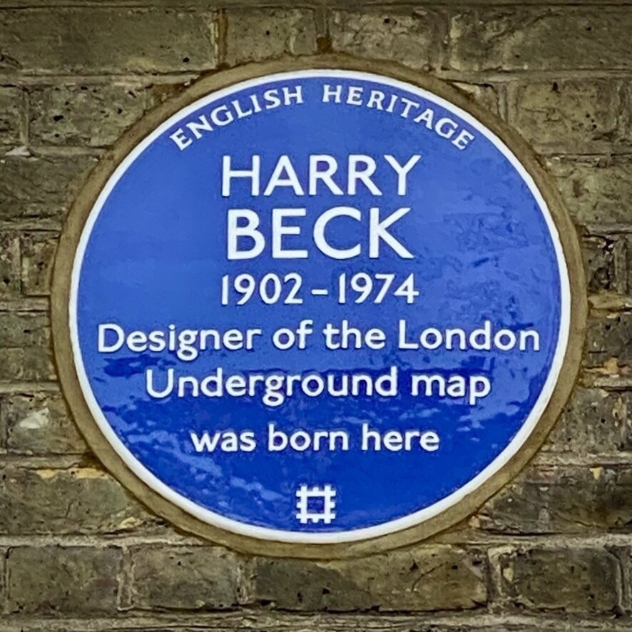
This is the photo I took:
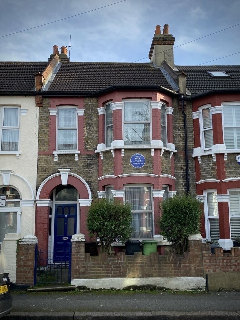
You can tell that a person who lived in this house did something significant because of the conspicuous blue plaque.
But before we get to that, some background.
In the 1800s, Britain was obsessed with railways. New lines were being proposed all over the country, and companies were being created to build and manage them. Fortunes were being made and lost.
To show off their new lines, railway companies designed maps.
These maps weren’t made to help passengers. They were there to show how powerful and important the railway companies were, and how their tendrils spread all over the nation.
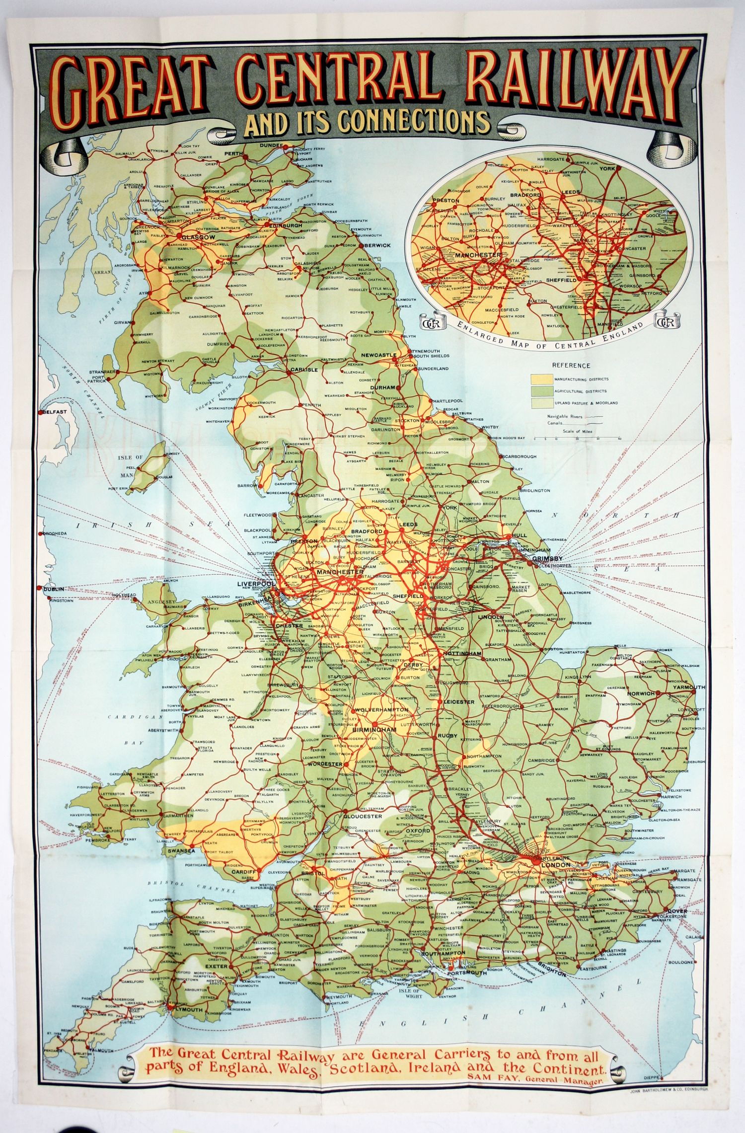
Good luck to anyone trying to use the Great Central Railway’s map to find their way from York to Manchester.
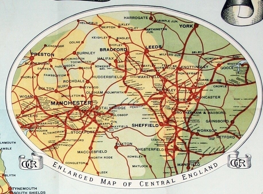
A content designer would say that these old maps were built around organisational needs, not user needs.
Harry Beck, who worked drawing electrical schematics for the company that was to become London Underground, saw things differently.
He recognised that what people really wanted was to know how to get to their destination. They didn’t care about the physical route of the railway lines, nor did they care about the exact geography. It’s the lines and the interchanges that are important.
Unlike the railway companies, Harry was thinking about the needs of the user, not the organisation.
In his own time, he drafted a diagram of the Underground as he would an electrical schematic. Lines were horizontal, vertical, or at a 45 degree angle. Stations in congested central London were spaced out, and stations further out were brought closer together. The only geographical feature in his design was the Thames.
In 1932, he presented his design to management at London Underground.
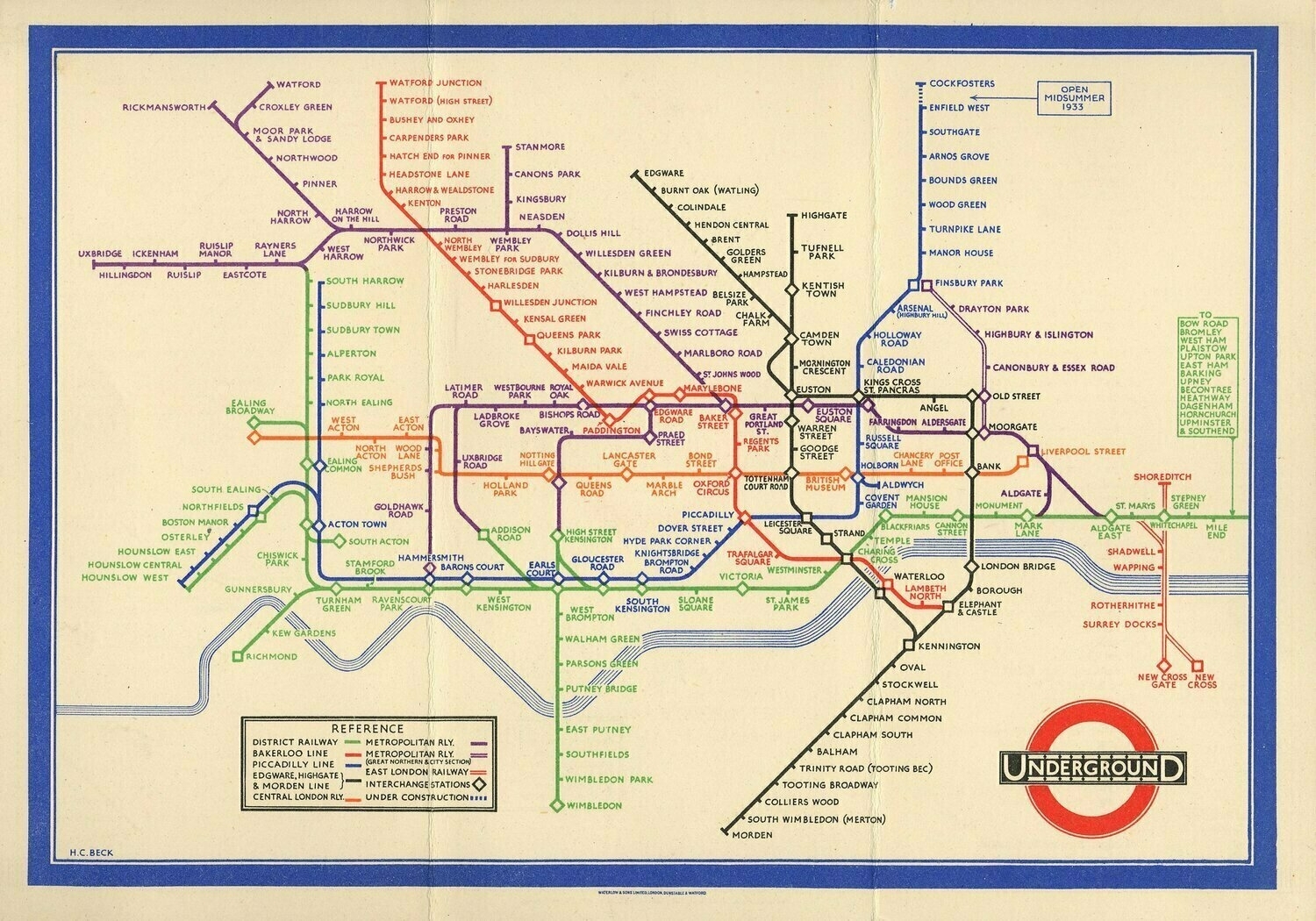
Unsurprisingly, management didn’t receive the new design well. They were used to the old way of doing things. The company rejected Harry’s design, but Harry pushed and pushed, confident that his vision was correct.
Eventually, possibly just to stop the noise, management relented, and agreed to make a test print of just 500 copies.
These were such a success that a year later, London Underground produced 700,000 copies. It was so popular that a reprint was needed after just one month, and Harry’s map has been in print ever since. It has grown to be an icon of London and the inspiration for transport maps all over the world.
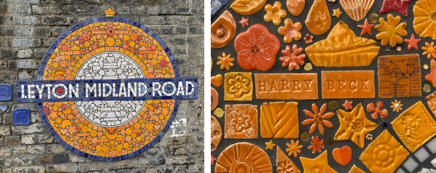
There’s a mosaic of a London Overground roundel on the station at the end of Harry’s road. The mosaic includes Harry’s name and a small snippet of his map.
Harry lived in a different time. He would never even have heard of content design. But, by guiding people through a complex system, and helping them – in Harry’s case, literally – get to where they needed to go, he did something that would be very recognisable to content designers today.
When you see a tube map now, it looks obvious and simple. But it took 100 years and one special person to move us away from maps built around organisational needs to ones built around the needs of users.
One of the Government Digital Service’s design principles is to ‘do the hard work to make things simple’. It’s difficult to think of a better example of that than Harry and his map.